Key Takeaways — brief reading, less than 30 seconds
- Brand shows up everywhere — invoices, error pages, hold music, job ads — and the guidelines are supposed to cover all of it. Most only cover the logo.
- Writing brand guidelines is the easy part. Getting anyone to follow them once the PDF is saved to the shared drive is the hard part.
- If your team cannot find the approved logo in under a minute, they will use the wrong one. Brand asset management is the practical fix.
- Most DAM platforms now offer the same features. The real differences show up in how painful they are to configure and how their pricing changes at renewal.
- If every campaign waits for the brand manager, the system is broken. Good brand management makes the approved choice the easiest choice.
Glossary12 terms
- Brand management: The process of maintaining and improving how people perceive your brand across every touchpoint — from strategy and positioning to the daily operations that keep it consistent.
- Brand equity: The value a brand carries in people’s minds — recognition, trust, loyalty, and willingness to pay a premium. Built through consistent repetition over time.
- Brand guidelines: The rulebook for how a brand should look, sound, and behave: logo usage, colour system, typography, voice, imagery, and do’s and don’ts.
- Brand assets: The files that carry your brand identity — logos in all variants and formats, colour palettes, fonts, templates, approved photography, icons, and video intros.
- Brand consistency: The customer does not feel like they are meeting a different company every time they open an email, see an ad, visit the product, or speak to support.
- Brand positioning: The strategic claim about where your brand sits in the market relative to competitors — the space you own in the customer’s mind.
- Brand experience: What people actually feel when they interact with your brand at any touchpoint. The proof of whether your positioning holds up in practice.
- Brand portal: A self-service page where internal teams, partners, or clients browse and download approved brand assets without needing full system access.
- Brand asset management: The operational discipline of organizing, versioning, and distributing brand files so every team uses the correct, current assets.
- Brand audit: A systematic review of every channel and touchpoint to check for off-brand usage, inconsistencies, and drift from guidelines.
- DAM: Digital asset management — a platform that centralises file storage, enforces naming and versioning, and controls who can access and distribute assets.
- Brand governance: The rules for who can change brand assets, how changes are approved, and how updates propagate across all teams and channels.
Brand consistency is one of those corporate things nobody finds interesting — until they are the one responsible for it. It lives in a document: primary colours, typography rules, logo placement. Usually the document is duller than the rules pinned up at a public swimming pool.
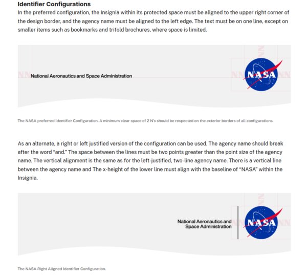
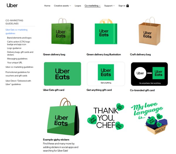
The rules still matter. Without them, logos drift, fonts multiply, and the company starts to look like several companies merged by accident. Keeping that from happening is routine work with established patterns. Here is what NASA’s and Uber’s guidelines look like:
What Brand Management Actually Means#
You have probably heard of brand guidelines — and probably picture them as a dry set of rules about fonts and logos, buried in some PDF. What if I told you that even a 404 error page on a website can be governed by one? Though honestly — most of the time, that guide really is just a PDF, sitting somewhere with rules that mysteriously stop applying the moment a deadline gets tight.
Brand management is the discipline that keeps those rules alive instead of filed away. It covers identity, voice, positioning, and every touchpoint where people experience the brand. That list is longer than most teams realise:
- Invoices and receipts
- Error messages and 404 pages
- Email footers and signatures
- Job listings — the tone of the “about us” paragraph is in the voice guide too
- Hold music on support calls — surprise, it is also part of the brand guideline
- The welcome message in onboarding
- Packing slips and shipping boxes
Brand management is where strategy stops being a deck and starts becoming invoices, templates, error messages, packaging, ads, and support replies.
In real life, the brand manager becomes the person people ping before they publish, export, print, upload, or send anything. Without systems, they turn into the search engine, the approval queue, and the police department for the whole company.
Brand Equity and Why Consistency Builds It#
Brand equity is what people already assume about you before you open your mouth. It takes years to build and about one bad rebrand to dent.
You do not need a study to feel it. When a new hire can describe your brand to a stranger without opening the guidelines, equity is working. When customers start asking “are you the same company we used last year?”, it is leaking.
Brand Guidelines: The Foundation#
Brand guidelines should cover what a person actually needs to use the brand without guessing:
- Logo usage — clear space, minimum sizes, approved variants, misuse examples.
- Colour system — primary, secondary, and extended palettes with hex, RGB, and CMYK values.
- Typography — typefaces, hierarchy, weights, and spacing.
- Voice and tone — how the brand sounds in writing, with examples.
- Imagery — photography style, illustration direction, iconography.
- Do’s and don’ts — visual examples of both compliant and non-compliant usage.
Writing them is the easy part. The hard part is getting anyone to follow them once the document is published.
69% of companies report that brand guidelines aren’t widely adopted or don’t exist at all.
Marq, 30 branding stats and facts(opens in new tab)
Large companies solve this by making the guidelines a living product. Spotify and Mailchimp publish theirs as interactive sites; Slack ships downloadable kits alongside the rules. The lesson is that a PDF loses the moment it is saved to the shared drive.
Voice guides prove that brand guidelines go well beyond logos and colours. Mailchimp(opens in new tab) publishes theirs publicly, built on four principles — plainspoken, genuine, translators, dry humour — with a rule that captures the whole idea: “Our tone is usually informal, but it’s always more important to be clear than entertaining.” Slack(opens in new tab)’s voice runs on five principles including “Be intentionally playful and bold” balanced by “Give every word intention and purpose.” Apple’s Human Interface Guidelines(opens in new tab) sums up its entire writing section in three words: “Be action oriented.” None of these are taglines. They are internal rules that shape every tooltip, error message, and marketing line those teams ship.
Of course, early-stage companies tend to keep their rules in a single document — or a small stack of them. Usually it is a PDF holding the documentation and requirements, and just as usually, those requirements get forgotten when the team is under pressure. That is the gap modern brand platforms exist to close. They do not just host guidelines as a portal editable by a designated few; they also enforce the rules at the moment decisions are made — which logo variant is appropriate for the situation, whether a seasonal version applies (for an autumn regional campaign, say), whether an asset should surface in this context at all.
In practice, when you pick a logo to drop into a design, the system filters the options down to the ones valid for your case. Before uploading a new media file, you may be asked to fill in mandatory fields so the asset meets the brand’s metadata requirements. These rules are often reinforced by an approval workflow, which makes it reasonable to expect that the final output will look consistent and match whatever the brand’s standards are at that point in time.
Brand Assets: Logos, Templates, and Everything Between#
Brand assets go well beyond the logo — they include everything that carries your visual and verbal identity. Without a single source of truth, versions multiply and drift until nobody is sure which file is the current one.
Here is a practical checklist you can audit your own brand kit against. The boring assets are where brand systems usually fail first: nobody forgets the hero logo, but they forget the invoice template, the email signature, the old pitch deck, and the social post someone copied from last year.
Logosthe minimum viable set
- Primary (horizontal) — the one most people mean by “the logo”.
- Stacked / vertical — for square or tall spaces.
- Icon or mark only — for favicons, social avatars, app icons.
- Monochrome — pure black and pure white, for cases where colour is not possible.
- Favicon set — 16×16, 32×32, 180×180 (Apple touch icon).
- Formats — SVG (web), PNG with transparency (general use), EPS or PDF (print vendors).
- Rules — minimum size, clear space, approved and forbidden backgrounds.
Colours
- Primary palette — full values: hex, RGB, CMYK, and Pantone where print matters.
- Secondary and accent colours — with the same value spread.
- Semantic colours — success, warning, error, info (if your product has a UI).
- Dark mode variants — if the product supports it.
- Approved gradients and tints — and which ones are off-limits.
Typography
- Primary typeface — headlines; name, foundry, licence, approved weights.
- Secondary typeface — body copy; often the same family with different weights.
- Monospace — if your product shows code, numbers, or data.
- System fallbacks for each, for email and environments where the custom font fails to load.
- Font files ready to hand over — WOFF2 for web, the desktop files designers actually need, and the licence document so nobody has to guess.
- Example hierarchy — from H1 through body, with sizes and line spacing.
Imagery and photography
- Style reference or mood board — what on-brand photography actually looks like.
- Licensed stock library credentials or a list of approved photographers and agencies.
- Colour grading direction — filter presets, saturation, contrast rules.
- Do’s and don’ts with visual examples — the single most useful thing in this category.
Icons
- A single icon set — named, licensed, with SVG source files.
- Sizing grid — typically 16 / 20 / 24 px for UI work.
- Stroke width and corner-radius rules so new icons match the set.
- Examples of on-brand and off-brand icons side by side.
Templates
- Social posts per platform — 1:1, 9:16, 16:9 at minimum.
- Email signature — often the most-seen brand asset in your company.
- Presentation deck — cover and content layouts.
- Business card and letterhead.
- Invoice or receipt template — commonly forgotten, surprisingly visible to customers.
- Proposal or pitch deck if you sell to other businesses.
Motion and soundoptional, but worth it if you ship video or audio
- Logo animation — intro and outro bumpers for video content.
- Approved easing and duration so motion feels like one brand across teams.
- Sonic logo or brand sound — if your category uses audio (podcast intros, app notifications, hold music).
A DAM eliminates logo graveyards through explicit version control. When a designer uploads a refreshed logo, it supersedes the previous version — downstream users see only the active file, while the brand manager retains access to the archived lineage for audit or rollback.
Mandatory metadata at upload — asset type, usage context, colour mode, minimum resolution — means every logo variant is categorised and searchable by its intended use. Folder taxonomies and smart collections group assets automatically, so a search for “primary logo, horizontal, RGB, for web” returns one definitive result instead of seventeen candidates.
Duplicate detection and controlled upload permissions keep unauthorised variants out — only designated brand custodians can introduce new logo files into the system.
Brand Asset Management in Practice#
In practice, brand asset management comes down to three approaches:
- Shared drives (Google Drive, Dropbox) — cheap and familiar, but folder chaos, no version control, and files leave with the employees who owned them.
- DAM platforms — high-volume asset handling with enforced naming, automatic versioning, and usage analytics.
- Brand portals — guidelines, locked templates, and compliance workflows layered on top of storage; ideal for external partners and regulated industries.
Without a system, once your channels × campaigns × team members exceed what folders can manage, a thirty-second file retrieval becomes a thirty-minute expedition through drives, links, and email attachments.
On Google Drive, a brand manager’s morning is Slack messages asking “where’s the latest deck template?” and “can I use this photo for social?” — each request a manual lookup, verification, and share link. A shared drive has no concept of asset status; approved, in-review, and expired all sit in the same folder.
In a DAM, those requests never arrive. The portal surfaces only current, approved assets organised by use case, and permission tiers show each team the files relevant to their role. The brand manager’s day shifts from asset concierge to reviewing which assets are being used, which are underperforming, and which are approaching expiration.
The interesting question is what “that system” actually looks like in the market. Here is how the five most-used DAM platforms compare on the features that matter for brand control:
| Feature | Frontify | Bynder | Brandfolder | Canto | Acquia DAM |
|---|---|---|---|---|---|
| External brand portal? | Yes | Yes | Yes | Yes | Yes |
| Interactive brand guidelines? | Yes | Yes | Yes | Yes | Yes |
| Required upload metadata? | Yes | Limited | Yes | Yes | Yes |
| Asset expiration dates? | Yes | Yes | Yes | Yes | Yes |
| Audit trail? | Yes | Yes | Yes | Yes | Yes |
| Locked templates? | Yes | Yes | Yes | Limited | Yes |
| Version control? | Yes | Yes | Yes | Yes | Yes |
| Granular permissions? | Yes | Yes | Yes | Yes | Yes |
| Expiring / password share links? | Yes | Yes | Yes | Limited | Yes |
At the top end, most DAM platforms now sell the same nouns: portals, guidelines, expiration, audit trails, locked templates. The difference is usually how painful they are to configure, and what happens to the price at renewal. The more interesting contrast is with a few adjacent tools that are not DAMs but own specific slices of brand control.
Adjacent tools worth knowing
- Canva Business / Enterprise(opens in new tab)from $10/user/mo annual (3-seat min) / Enterprise custom — brand-locked templates where the logo, colours, and fonts are fixed and only designated text or image slots are editable. Anyone on the team can produce on-brand output without a design review. What it does not do: asset expiration, required metadata, or a proper external brand portal.
- Figma Organization(opens in new tab)from $55/full seat/mo annual / Enterprise $90 — shared component libraries and design tokens that propagate across every design file the moment they are updated. The practical source of truth for product design teams. What it does not do: external brand portal, asset metadata, expiration, or anything for non-designers.
- Papirfly(opens in new tab)quote-only, no free trial — the strictest template lock model on the market. Only designated text and image slots are editable, everything else frozen. Regional teams and franchisees produce marketing materials without a designer in the room. Stronger governance than Canva, narrower asset coverage than a full DAM.
Brand Positioning and Brand Experience#
Positioning is the claim; experience is what actually happens. The gap between them is where most brands quietly die — usually in the small things: a support reply that sounds nothing like the homepage, a checkout flow that forgets who you are.

Airbnb’s 2014 “Belong Anywhere”(opens in new tab) campaign closed that gap. They did not just change the logo — they redesigned every page of web and mobile UX, launched Neighbourhood Guides and Experiences, and encouraged user-generated host stories. The positioning reached product, support, and community, not just ads.
Tropicana — PepsiCo’s orange-juice brand — is the counter-example. In 2009 they replaced the iconic orange-with-straw packaging(opens in new tab) with a minimalist redesign to signal modernity. Customers bought Tropicana for comfort and familiarity, and the new look felt like a different product on the shelf. The original packaging was back within weeks.
Measuring Brand Management#
Measuring brand management is tricky. The standard frameworks — brand awareness, recognition, loyalty, and value — all require surveys, trackers, or valuation models most teams never commission.
The real test is whether a junior PM can run a campaign launch without pinging you once. If they can, you have built a system. If they cannot, you are still the system.
Frequently Asked Questions About Brand Management #
What is brand management?
What is the difference between brand management and brand asset management?
Why does brand consistency matter?
What should brand guidelines include?
When does a team need a DAM for brand management?
How do you measure brand management success?
What is the role of a brand manager?
How is brand equity built over time?